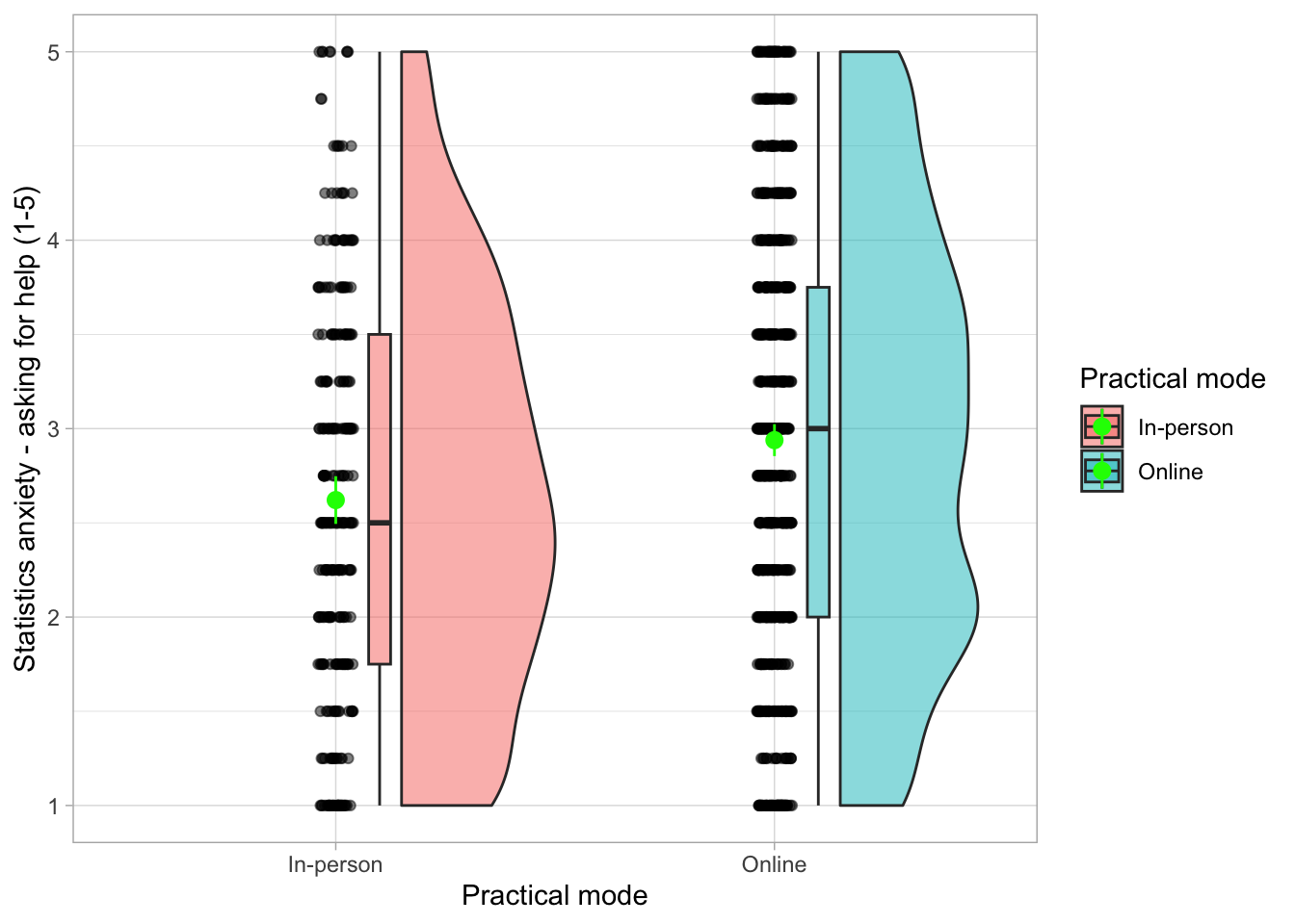
library(ggplot2)
library(ggrain) # optional - you don't need to load it if you specify it when using geom_rain()Skills Lab 05: t-test
The sample take-away paper is now live! You can find it in either of the following folders on Posit cloud: Week 5, Week 6, Take-away paper. This project will keep jumping out at you at every opportunity, because it’s absolutely crucial that you attempt to complete the tasks in the sample TAP on your own. This way you will get a sense of what’s going to be expected from in the real take-away paper. We’ll go over some of the tasks together in next week’s skills lab, but there won’t be time to cover every task. If you get stuck while working on this on your own, you can post on Discord, ask us in a practical session or book into a drop-in meeting.
Setup
Packages and data
Load the necessary packages:
Data
Load the data and save into an object called smarvus_tib
smarvus_tib <- readr::read_csv("data/smarvus_data.csv")Codebook
ricomisc::rstudio_viewer("smarvus_codebook.html", "data")Hypothesis
We’re going to be testing the following hypothesis:
Participants who attended in-person practicals will score lower on XXXXX compared to participants who attended practical classes online.
Pick a variable to replace XXXXX:
Attitudes towards mathematics (persistence subscale)
Fear of Negative Evaluation
Cognitive Reflection
Intolerance of Uncertainty Scale
Social anxiety (social interaction)
Self-efficacy
Stats anxiety (asking for help)
You decided to test social anxiety. So the hypothesis is:
Participants who attended in-person practicals will score lower on social anxiety compared to participants who attended practical classes online.
Task 1: Quick data cleaning
We want to compare online and in-person practical attendees.
Which variables from the dataset can we use here?
Are the variables in the right format? Can we use them as they are or we need to do something?
Perform any necessary data cleaning and save the result into a new dataset called
smarvus_prac
The main point here is that we need to run a t-test, which can only compare two groups. If we look at the column in_person_practicals int the dataset, you’ll notice there are 4 groups. We need to keep only the rows with values “In-person”, and “Online”.
We’re creating a new object here called smarvus_prac. Sometimes when we make changes to the dataset, we over-write it and save into smarvus_tib instead. If we’re using using mutate to create a new variable, it’s perfectly safe to overwrite. However, here we’re making a substantial change to the dataset. So we’ll save it into a new object to avoid problems with over-writing our original data.
smarvus_prac <- smarvus_tib |>
  dplyr::filter(
    in_person_practicals %in% c("In-person", "Online")
  )
Task 2: Summary table
Summary tables are a good way to get a sense of what’s happening in our dataset.
What would be the best way to summarise the data?
What kind of metrics should we include in our summary table?
What kind of changes should we make to make the table look nicer?
smarvus_sum <- smarvus_prac |>
  dplyr::group_by(in_person_practicals) |>
  dplyr::summarise(
    n = dplyr::n(),
    mean = mean(lsas_sr_soc, na.rm = TRUE),
    ci_lower = ggplot2::mean_cl_normal(lsas_sr_soc)$ymin,
    ci_upper = ggplot2::mean_cl_normal(lsas_sr_soc)$ymax,
    median = median(lsas_sr_soc, na.rm = TRUE),
    min = min(lsas_sr_soc, na.rm = TRUE),
    max = max(lsas_sr_soc, na.rm = TRUE)
  )


smarvus_sum |>
  knitr::kable(
    digits = 2,
    col.names = c("Attendance mode", "N", "Mean", "95% Lower CI", "95% Upper CI", "Median", "Min", "Max")
  ) |>
kableExtra::kable_styling()| Attendance mode | N | Mean | 95% Lower CI | 95% Upper CI | Median | Min | Max |
|---|---|---|---|---|---|---|---|
| In-person | 273 | 2.57 | 2.49 | 2.64 | 2.5 | 1 | 3.92 |
| Online | 703 | 2.48 | 2.44 | 2.53 | 2.5 | 1 | 4.00 |
Task 3: Plots
The basics:
What kind things do we want to show on our plot?
What kind of plot is appropriate?
The presentation:
- What changes can we make to make our plot more presentable?
# bare minimum, thoroughly okay plot:

smarvus_prac |>
  ggplot2::ggplot(data = _, aes(x = in_person_practicals, y = stars_ask)) +
  ggrain::geom_rain(alpha = 0.1) +
  stat_summary(fun.data = mean_cl_normal, colour = "red") + # or some other obvious colour to show the pointrange against the scatter
  labs(x = "Attendence mode", y = "Asking for help anxiety (1-5)") +
  theme_minimal()
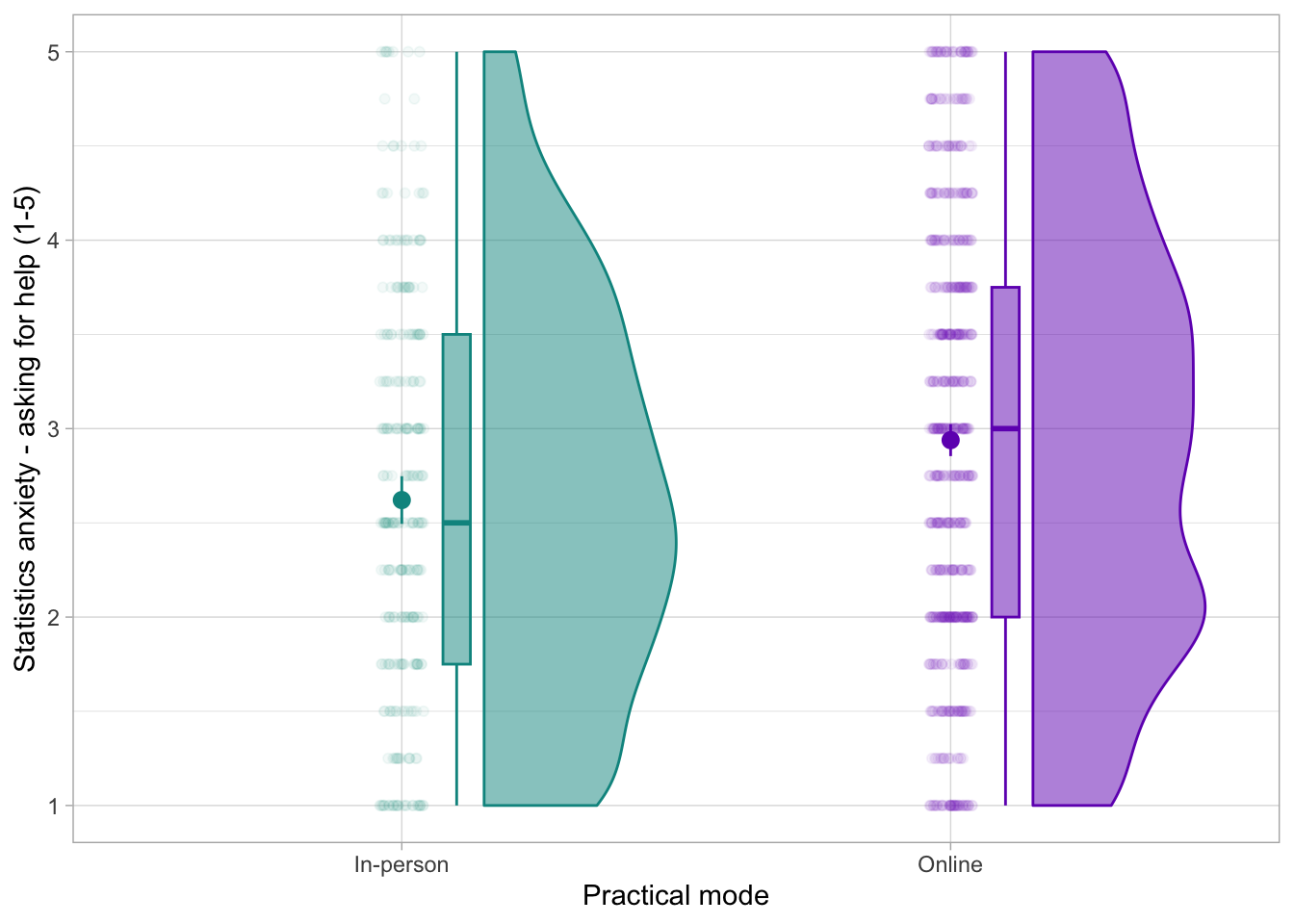
We can make the plot look a little nicer by adding a splash of colour. The main difference here is that we want the colour (and fill) to be split by the attendance mode group. Because of this, we need to specify the colour and fill arguments in the aesthetics aes().
We can then change the default colour using scale_X_manual replacing X with colour or fill.
Finally, the legend for this plot is a little redundant. We use the theme() function to remove it.
# more snazzy:

smarvus_prac |>
  ggplot2::ggplot(data = _, aes(x = in_person_practicals, y = stars_ask,
                                fill = in_person_practicals,
                                colour = in_person_practicals)) +
  ggrain::geom_rain(alpha = 0.1) +
  stat_summary(fun.data = mean_cl_normal, colour = "black") +
  labs(x = "Attendence mode", colour = "Attendence mode", fill = "Attendence mode", y = "Asking for help anxiety (1-5)") +
  scale_colour_manual(values = c("darkcyan", "darkmagenta")) +
  scale_fill_manual(values = c("darkcyan", "darkmagenta")) +
  theme_minimal() +
  theme(
    legend.position = "none"
  )
Task 4: t-test
- Based on the plot, do you think the difference is going to be statistically significant?
- Perform a t-test to test the hypothesis specified at the beginning
- What’s the mean difference between the two practical attendance modes?
- Is this difference statistically significant?
- Report the results using the following form:
test_statistic_name(degrees_of_freedom) = test_statistic_value, p = p_value, Mdiff = difference_in_means, 95% CI [CI_lower, CI_upper]
smarvus_prac |> t.test(lsas_sr_soc ~ in_person_practicals, data = _)
    Welch Two Sample t-test

data:  lsas_sr_soc by in_person_practicals
t = 1.7719, df = 490.1, p-value = 0.07704
alternative hypothesis: true difference in means between group In-person and group Online is not equal to 0
95 percent confidence interval:
 -0.008895145  0.172273730
sample estimates:
mean in group In-person    mean in group Online
2.565018 2.483329 t(490.1) = 1.77, p = 0.08, Mdiff = 0.08, 95% CI [-0.01, 0.17]
Render!
Render your document!
References
- A fun meta-research paper discussing why bar charts are often not a great idea: https://journals.plos.org/plosbiology/article?id=10.1371/journal.pbio.1002128